Products
Discover HeroesFind top LinkedIn creators in your niche.Post CreatorAI-powered composer with your tone and style.Trending PostsSee what's going viral on LinkedIn right now.
Use Cases
Repurpose ContentTurn YouTube, blogs, and articles into LinkedIn posts.Carousel GeneratorCreate swipeable LinkedIn carousels with AI.30-Day Auto CalendarPlan and auto-publish a month of posts.LinkedIn MCP ServerPost to LinkedIn from Claude, Codex and OpenClaw.For AgenciesRun your clients' LinkedIn content in one place.
Tools
Text FormatterBold, italic, and Unicode styles for posts.Hashtag GeneratorFind the best hashtags for your content.Engagement CalculatorMeasure your post performance instantly.Hook GeneratorAI hooks that stop the scroll.Post PreviewSee exactly how your post will look.Content CalendarPlan and schedule your LinkedIn content.Browse all 90+ free tools
Resources
Free Tools90+ LinkedIn tools, no signup required.Templates100 ready-to-use LinkedIn post templates.GuidesStep-by-step LinkedIn growth playbooks.CollectionsCurated tool sets by role and goal.CompareViralBrain vs. other LinkedIn tools.BlogLinkedIn growth tips and strategies.
Pricing
LoginStart 7 Days Trial
Back to Discover Heroes

LinkedIn Content Strategy & Writing Style

203 Viral ScoreView on LinkedIn

1 person tracking this creator on ViralBrain

Warm Analysis

This creator positions herself as a data storytelling and visualization educator who helps organizations turn technically accurate information into decisions and action. Her content centers on chart design, stakeholder-aware communication, AI-assisted analysis, and practical teaching through workshops, courses, webinars, and recurring formats like “Chart Anatomy.” She stands out by connecting visual craft with business context - exploring everything from comet charts in Excel and Power BI to adapting one financial insight for CEOs, sales leaders, and operations teams. Her brand also blends hands-on corporate training with accessible public education, while candid posts about family, time offline, and unusual workshop venues make an otherwise technical niche feel notably human.

Performance Overview

Followers

10.4K

Connections

6.4K

Avg. Engagement

182

Engagement Rate

Posts/Week

Viral Score

203

Posts Analyzed

1

Top Posts by Engagement

💯💯💯

LinkedIn post image: 💯💯💯
1.2K11110100 viral
about 1 month ago
View on LinkedIn

The goal of data is to turn ‘information’ into ‘action’. We need a visual like this in every kitchen. Hopefully it will drive healthier choices and a meaningful change.. (I cover visual stories like…
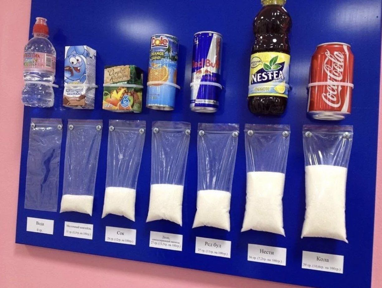
LinkedIn post image: The goal of data is to turn ‘information’ into ‘action’. We need a visual like this in every kitchen.
7621418 viral
Design & UX26 days ago
View on LinkedIn

It is an honor to be presenting at the FP&A Trends Webinar alongside two professionals, sharing real-world lessons on change management from leading a global Rolling Forecast transformation. 🗓️Mark…
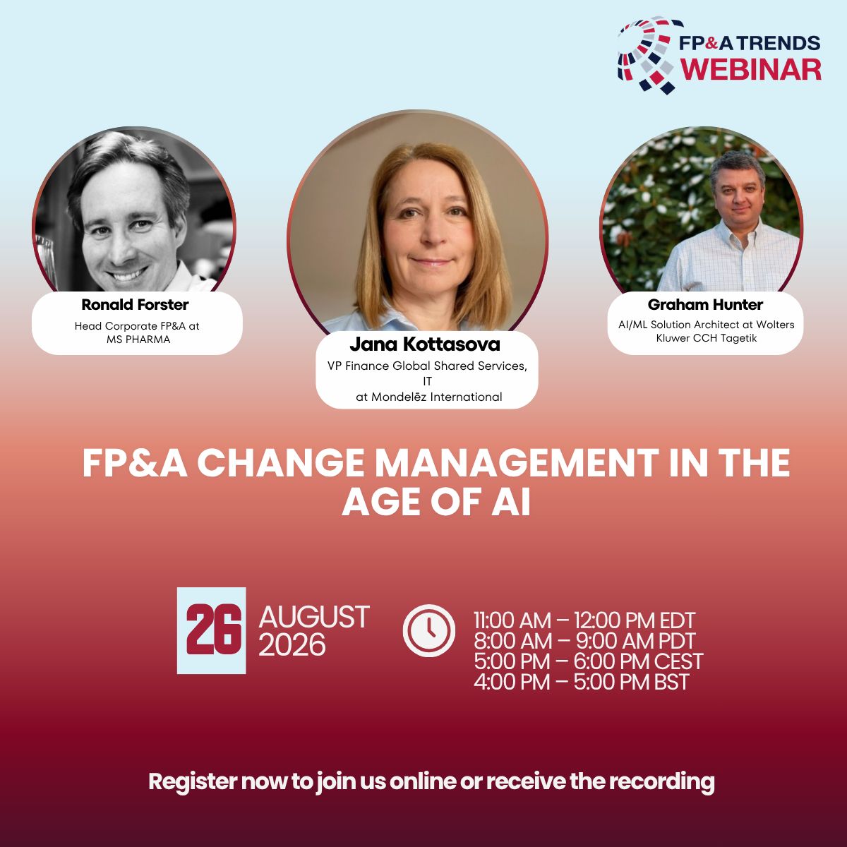
LinkedIn post image: It is an honor to be presenting at the FP&A Trends Webinar alongside two professionals, sharing real-world lessons on ch
1463116 viral
Finance & Fintechabout 2 months ago
View on LinkedIn

There are many versions of the bullet graph. This is the one I use. Often. So often, in fact, that some of my clients call it “Olga’s chart.” It isn’t mine, of course. It was created by data visuali…

61429 viral
Design & UX5 months ago
View on LinkedIn

At one of his workshops Steve Wexler showed us a beautiful and intuitive comet chart. I fell in love with it immediately and was eager to use it for my next my next two-points-in-time comparison.…

261207 viral
Design & UX4 months ago
View on LinkedIn

I unintentionally took almost all of July and August off LinkedIn. (I was going to say “social media,” but LinkedIn is the only social network I actually use. 😊) There was a good reason. My oldest…

LinkedIn post image: I unintentionally took almost all of July and August off LinkedIn.
58106 viral
Personal Developmentabout 1 month ago
View on LinkedIn

Posting Patterns & Frequency

0.0 posts/week

Posts / Week

1

Total Posts Analyzed

HIGH

Posting Frequency

Timezone: UTC

Best Performing Days

FridayThursday

Best Performing Times To Post

Morning UTC, approximately 07:45-11:00

Topics & Content Focus

Primary Topics

Decision-oriented data storytelling and visualizationTranslating analytical insight into clear business actionData communication tailored to stakeholder priorities

Secondary Themes

Chart design and visual message clarityCorporate data-literacy training and workshopsProfessional storytelling through unusual workplace settingsHealth and behavior change through accessible visual information

Industry Focus

B2B data visualization and analytics enablementCorporate learning and executive communicationCross-industry business intelligence, including retail, media, manufacturing and financial services

Content Categories

Educational insightVisual analysis and chart critiqueWebinar and course promotionPersonal professional storytellingCommunity-oriented discussion prompts

Performance Insights

0%

Avg Engagement Rate

STABLE

Performance Trend

Best Performing Topics

Emotionally expressive, low-context postsBroadly relatable statements about the value of dataPractical chart and visual communication guidance

Virality Signals

Very high comment and like concentration around emotionally expressive contentConcrete real-world consequences increase appealDecision-focused visual advice is more engaging than purely promotional messagingShares remain comparatively limited, suggesting strong passive appreciation but modest redistribution

Structure & Quality

490

Avg Length (Words)

HIGH

Depth Level

ADVANCED

Expertise Level

8/10

Uniqueness Score

Common Hooks

A practical claim about what makes data usefulA contrast between technically correct communication and communication that drives decisionsAn unexpected personal setting used to introduce a professional lessonA short emotional or celebratory signal

Common Endings

Invitation to explore a course, webinar or visual resourceQuestion prompting readers to share an experience or imageForward-looking statement about action, change or better decisions

Value Delivery Methods

Connects visualization choices to decisions and behaviorExplains how the same insight should be adapted for different stakeholdersCombines analytical principles with presentation techniqueUses concrete professional contexts to make data communication more memorable

Formatting Style

Short introductory paragraphsPlain-language explanationsBulleted learning objectives in promotional postsSelective emoji useLinks embedded after the value proposition

Audience & Tone

YES

Question Usage

0%

Response Rate

Detected Tone

Practical expertHuman-centered educatorSmart-casual professionalCurious observerAction-oriented storytellersemi-formalfirst-person

Interaction Style

Audience primarily signals approval through likesComments spike around emotionally resonant or highly familiar contentEducational posts generate quieter, lower-friction engagementDirect questions are used to invite community participation

Community Building Signals

Invites readers to contribute personal examples and imagesUses free live education to build trust and recurring participationPositions the creator as a facilitator of better data communication rather than only a content broadcaster

Writing Style Patterns

Content Strategy

Hook: A practical claim about what makes data usefulTone: semi-formalCTA: Soft promotional link to an educational resource

Writing style breakdown

<start of post>

A chart can be technically correct and still leave people wondering what they are supposed to do with it.

I was reminded of this during a recent workshop. We were looking at several charts that contained all the right numbers, clear labels, and carefully chosen colours.

And yet, some of them made the message harder to understand.

The problem wasn’t the data. The problem was that the chart was asking the audience to do too much work.

They had to compare categories, remember the previous period, find the biggest change, and decide whether that change mattered. All of this before they could even start discussing what to do next.

A good chart should not make people solve a puzzle before they can see the point.

This is why I always encourage people to start with the message, not with the chart type.

What should the audience notice?

What decision should the chart support?

Which comparison is actually important?

Only after answering these questions does it make sense to choose between a bar chart, a line chart, a slope chart, or something else entirely.

Sometimes the best visual is also the simplest one. A clear title, a focused comparison, and one highlighted number can be more useful than a dashboard full of technically impressive elements.

And sometimes the chart that takes the longest to create is not the chart that helps people understand the situation fastest.

That distinction matters even more when the audience is busy, unfamiliar with the data, or making a decision under time pressure.

A chart is not successful because it contains everything.

It is successful when people quickly understand what matters and know what to do next.

What is the most difficult chart you have had to explain recently? I’d love to hear about it in the comments.

<end of post>

1. OVERALL STYLE & VOICE
2. STRUCTURAL FLOW & LOGICAL PROGRESSION
3. SPACING, LINE BREAKS & VISUAL FLOW

Sign in to unlock the full writing analysis

Apply 's patterns to your posts

Free tools to help you write, score, and benchmark in the same style.

LinkedIn Hook Generator

Generate scroll-stopping hooks in the same style top creators use.

Open tool

LinkedIn Post Scorer

Score your draft against viral post patterns before you publish.

Open tool

LinkedIn Engagement Calculator

Benchmark your engagement rate against creators in your niche.

Open tool

More LinkedIn creators to learn from

Discover all

Other creators worth studying alongside .

Matt Green

Matt Green

Co-Founder & Chief Revenue Officer at Sales Assembly | Developing the GTM Teams of B2B Tech Companies | Investor | Sales Mentor | Decent Husband, Better Father

87 Viral Score

Anastasiia Leiman

Anastasiia Leiman

Helping ex-corporates turned consultants & coaches make revenue in their biz from Year 1 using LinkedIn🔸Ex-Fin Director (15y) managing $1B bizs -​> 6-figure Coachsultant in 12 months 🔸ICF-accredited🔸Speaker🔸Mum of 2

370 Viral Score

Andreas Horn

Andreas Horn

Head of AIOps @ IBM || Speaker | Lecturer | Advisor

21 Viral Score

Jonathan Parsons

Jonathan Parsons

Marketing Director - Clinique | AI Leader & Advocate | Brand Builder

26 Viral Score

Awa K. Penn

Awa K. Penn

Teaching 1 Million+ People AI Everyday

151 Viral Score

Charlie Hills 🦩

Charlie Hills 🦩

I help you (actually) use AI for content.

83 Viral Score

€1 trial · 7 days

Automate your LinkedIn for 30 days

ViralBrain plans, writes, and schedules your LinkedIn content, using official LinkedIn APIs so your account stays safe.

  • Official LinkedIn APIs, no risk of ban
  • You approve every post before it goes live
  • Cancel anytime
Start €1 trial€39 Pro or €69 Premium · cancel anytime

30-day plan

On track
1
2
3
4
5
6
7
8
9
10
11
12
13
14
15
16
17
18
19
20
21
22
23
24
25
26
27
28
13 posts queued · auto-publishing
€1 · 7-day trial

Write like this creator and auto-post for 30 days.

ViralBrain learns their voice and publishes for you.

Try it free

Write like this creator.

Try it free

Discover more LinkedIn creators · ViralBrain

Other LinkedIn creators

  • Yanni Pappas
  • Alan Blount
  • Eduardo Ordax
  • Ben Lang
  • Aakash Gupta
  • Anton Osika
  • David Bland
  • Samuel Beek
  • Jimmy Bijlani
  • Dr. med. Timo Rodi
  • Yash Sheth
  • Dan Rosenthal
  • Teresa Torres