Commercial Bank of Ethiopia, what on earth is this UX? It took me way too long to realize the numbers aren't where they’re supposed to be. Trying to type a PIN shouldn't feel like a memory test! Wh…

72212113
UX Design5 months ago

LinkedIn Content Strategy & Writing Style
UI/UX Designer
0 people tracking this creator on ViralBrain
Miheret Merid positions himself as a pragmatic, observational UX strategist who bridges the gap between digital interfaces and real-world human behavior. His content strategy centers on "deconstructing the everyday," using localized case studies like the Commercial Bank of Ethiopia app and physical elevator ergonomics to illustrate high-level design principles. What makes Miheret notable is his ability to pivot from sharp, critical teardowns of friction points to constructive, system-driven redesigns that prioritize accessibility and muscle memory. By intersecting community building via his Telegram channel with transparent, public-facing critiques, he establishes a brand rooted in functional empathy and the psychological impact of micro-interactions.
0
0
167
—
0.3
—
1
Commercial Bank of Ethiopia, what on earth is this UX? It took me way too long to realize the numbers aren't where they’re supposed to be. Trying to type a PIN shouldn't feel like a memory test! Wh…
CBE Mobile App Redesign I’ve always liked the simplicity of the old CBE user experience, but after the newer dark mode update, some parts started feeling difficult to read and visually inconsistent.…
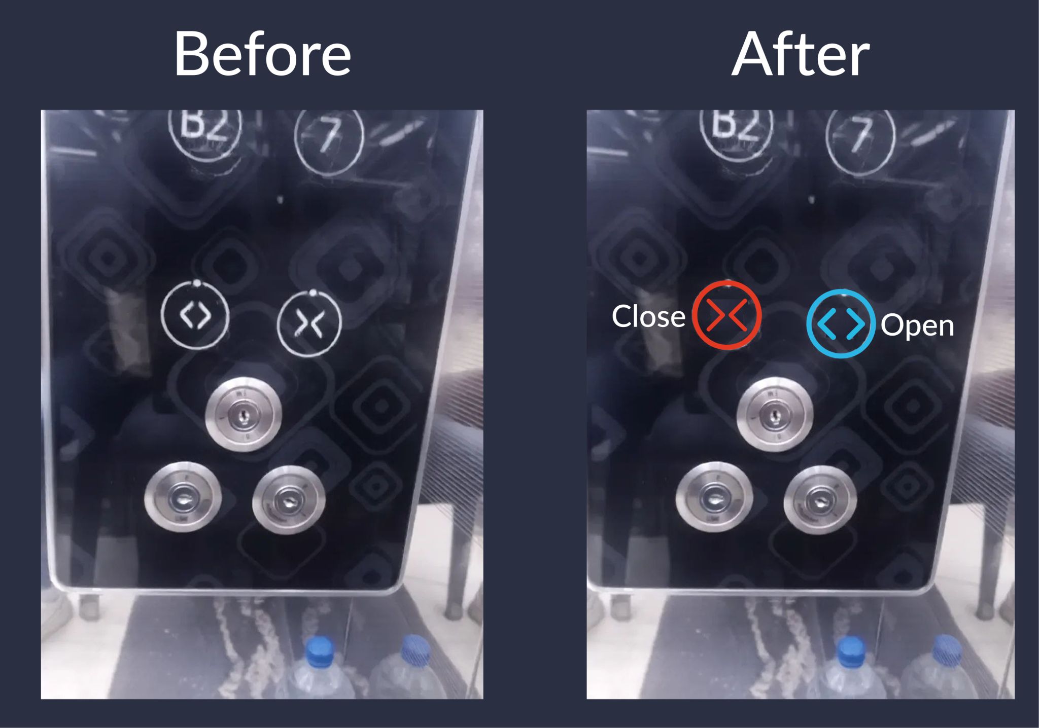
My building’s elevator UX nearly turned me into a villain. I remember stepping into the elevator one day and seeing someone running toward it. I panicked and pressed what I thought was the “open” but…
You don’t need more features to improve your product. You need better micro-interactions. That small “pop” animation after a successful payment? That tiny celebration moment? It’s not decoration. It’…
Hey everyone 👋🏾, I recently created a Telegram channel and I’d love to have you there. It’s a simple space where we talk about UI/UX, share ideas, ask questions, learn from each other, and just co…
Update: They fixed it! 🎉 I appreciate the Commercial Bank of Ethiopia for acknowledging user pain points and updating the interface. It’s a solid step forward.
0.3 posts/week
Posts / Week
27.5 days
Days Between Posts
1
Total Posts Analyzed
LOW
Posting Frequency
166.57%
Avg Engagement Rate
STABLE
Performance Trend
450
Avg Length (Words)
HIGH
Depth Level
ADVANCED
Expertise Level
0.85/10
Uniqueness Score
YES
Question Usage
0.8%
Response Rate
Writing style breakdown
<start of post>
Good design is invisible. Bad design is an argument.
I was trying to book a flight last night and the "Date Picker" felt like it was actively fighting me. Every time I selected a return date, the app reset my departure.
It took me four tries to realize the logic was backwards.
This is what we call "Negative Friction."
How it looks (UI)
The brand colors
The flashy animations
But we forget the most important part: How it flows.
If a user has to stop and think about "how" to use a button, you’ve already lost. Standard patterns aren't boring; they are functional. They allow the user to complete their task without their brain hitting a speed bump.
I took a stab at redesigning that flow to prioritize "Selection Memory." By keeping the departure date visible while picking the return, the cognitive load drops to zero.
It’s a small change, but it makes the experience feel "right."
Would love to hear your thoughts on this. Have you ever had an app make you feel like you were doing a math test?
#UXDesign #ProductDesign #UserExperience #UIUX #DesignThinking #MobileApp
<end of post>
Sign in to unlock the full writing analysis
Free tools to help you write, score, and benchmark in the same style.
Other creators worth studying alongside Miheret Merid.

Dan Martell
📘 Bestselling Author (Buy Back Your Time) 🚀 Building AI startups @Martell Ventures ⚙️ 3x Software Exits • $100M+ HoldCo 💬 DM "COACH" if you're looking to scale
102 Viral Score

Richard Tromans
Founder, Artificial Lawyer
41 Viral Score

Xavier Mitjana
Formo a profesionales para que dominen la IA | Formación práctica en adopción de la Inteligencia Artificial | IA en acción
23 Viral Score

Ori Zilbershtein
Founder @ Maxfusion.ai | +30K followers
530 Viral Score

Austin Belcak
I Teach People How To Land Amazing Jobs Without Applying Online // Ready To Land A Great Role In Less Time (With A $44K+ Raise)? Head To 👉 CultivatedCulture.com/Coaching
3 Viral Score

Alexander Klöpping
Uitgever van Smartphonevrij Opgroeien & Voorbereid
41 Viral Score
ViralBrain plans, writes, and schedules your LinkedIn content — using official LinkedIn APIs so your account stays safe.
Write like Miheret Merid.