Simon S. Morel on the 10-Second SaaS Landing Test
A detailed breakdown of Simon S. Morel’s viral critique of Understory and what SaaS teams can copy to boost clarity and conversions.
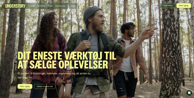
Simon S. Morel recently shared something that caught my attention: "Her er et dansk SaaS-site der består "10 sek"-testen". He added, "Ros skal også gives hvor den er velfortjent," and then used Understory as a concrete example of a landing page that gets a lot right in the first moments.
That post resonates because the "10 second test" is one of the most practical filters in conversion rate optimization: if a new visitor lands on your site, do they quickly understand what you do, who it is for, and what to do next? If the answer is not obvious, you do not just lose conversions - you lose trust.
In this article, I want to expand on Simon’s observations and turn them into a repeatable checklist you can apply to your own SaaS or AI product page. I will walk through the same four themes he called out: hero composition and contrast, category and copy clarity, ICP framing with momentum, and the small navigation quirks that quietly leak conversions.
The 10-second test: what it is (and why it works)
The 10-second test is simple: show someone your landing page for 10 seconds, hide it, and ask them:
- What does this product do?
- Who is it for?
- What should you do next?
- What makes it different or credible?
If your answers are fuzzy, your page is doing what many pages do: it is asking the visitor to work. Visitors do not want homework. They want a confident guide.
Simon’s post is a great reminder that passing the test is often about basics executed with taste: visual hierarchy, sharp copy, clear audience framing, and frictionless next steps.
"Jeg er ikke ét sekund i tvivl om, hvad Understory er, og at det er til "oplevelses-udbydere"."
That is the outcome we are after.
1) Hero composition and contrast: make the headline win every time
Simon’s first point is about composition: the relationship between the headline and the video background. He notes that the headline stays "knivskarpt" (razor sharp) because the video is edited in a muted way, so the text always wins.
This is a common failure mode in SaaS design: motion and visuals overpower meaning. A beautiful hero with weak contrast can tank comprehension. The visitor does not read - they skim. If your hero does not scan cleanly, you fail the test before copy even has a chance.
What to borrow from this approach
- Contrast is not optional. If you use video, ensure the overlay, color grading, and typography keep the headline readable on every frame.
- One dominant message. Your hero should have a single primary claim. Supporting text can add detail, but the headline is the anchor.
- Match the feeling to the category. Simon says it feels more like "oplevelser" (experiences) than "booking-software". That matters. If you sell to experience providers, you are not selling "software" emotionally - you are selling a way to deliver smoother, more premium experiences.
A quick self-audit
Open your homepage on a laptop and on a phone. Squint. If you cannot read the headline instantly, reduce background complexity, increase overlay strength, or simplify the motion.
2) Copy and category clarity: remove doubt about what you are
Simon’s second point is the heart of the 10-second test: he is never in doubt about what Understory is and who it is for. He also highlights that the copy shows how it helps sell, and that the "alt i ét system" (all-in-one system) narrative is supported.
Many SaaS pages try to be clever. Clever is expensive. Clarity is profitable.
The three-part clarity formula
If you want visitors to immediately "get it", your above-the-fold copy should usually communicate:
- Category: what type of product is it?
- ICP: who is it specifically for?
- Outcome: what measurable or felt benefit do they get?
For Understory, the ICP is explicit: experience providers. That is a strong move because it eliminates the wrong traffic and reassures the right traffic.
What "all-in-one" must do to work
"All-in-one" can be powerful, but only if you prove it. Otherwise, it reads like generic SaaS wallpaper.
To support an all-in-one claim:
- Name the key jobs-to-be-done it covers (booking page, payments, availability, confirmations, etc.).
- Show it visually (screens, short demo clips, simple diagrams).
- Connect features to sales outcomes (more bookings, fewer drop-offs, higher trust).
Simon is pointing out something subtle: the narrative is not just stated - it is reinforced.
3) Frame the ICP with categories and build momentum
Simon’s third point is about framing the ideal customer profile with concrete categories: "Hvilken type oplevelse skaber du?" He also praises the momentum created by a "sådan virker det" (how it works) video and a low-friction hook that feels a bit like magic: a better booking page in 15 seconds, in exchange for signup.
This is a masterclass in guided discovery.
Why category questions convert
When a landing page asks a visitor to self-identify, it does three things:
- Reduces cognitive load: the visitor does not need to translate generic messaging into their context.
- Signals specialization: you are not for everyone, you are for them.
- Creates micro-commitment: clicking a category is a small "yes" that often leads to a bigger "yes".
You can apply this even if you are not in bookings. Examples:
- "What are you building?" (API, mobile app, internal tool)
- "Who do you sell to?" (SMB, mid-market, enterprise)
- "What is your main goal?" (reduce churn, increase activation, speed up onboarding)
Momentum design: the sequence matters
Understory appears to sequence things well:
- Clarify the category and audience
- Show "how it works" quickly
- Offer an immediate win (better booking page in 15 seconds)
That sequence is persuasive because it answers the visitor’s silent questions in order:
- "Is this for me?"
- "Do I understand it?"
- "Will it work for my situation?"
- "Can I try it without pain?"
The "magic" hook, grounded
A promise like "in 15 seconds" is strong because it compresses time-to-value. But it only works if:
- The output is genuinely useful (not a toy demo)
- The step required is minimal (email, not a sales call)
- The result aligns with the core product value (not a random gimmick)
If you can offer a fast, tangible preview of value, you often shift evaluation from "Should I trust you?" to "This already helped me."
4) The small nav bar quirks that quietly cost conversions
Simon’s fourth point adds balance: the page is strong, but the navigation hierarchy has some "finurlige valg" (quirky choices). He mentions "Se demo" being placed as a shortcut in the middle, and "Login" being placed unusually (and written in English), likely to make room for a "Book demo" CTA on the right.
This is the kind of detail many teams dismiss, but it matters because navigation is a trust signal. Visitors use the header to orient themselves. When patterns are unusual, it can create a tiny moment of doubt.
What a header should optimize for
- Predictability: keep common items where users expect them.
- Primary action clarity: one main CTA, not competing CTAs.
- Audience fit: self-serve products typically emphasize "Start" or "Try"; sales-led motions emphasize "Book demo".
Practical tweaks to consider
If you recognize your own site in this:
- Use one dominant CTA (for example: "Get started" or "Book demo") and make secondary actions visually quieter.
- Keep "Login" in a standard position (often top-right) and keep language consistent across the site.
- If you have both self-serve and demo flows, make the choice intentional: one primary, one secondary, or route by segment (for example: a toggle or a page that helps visitors choose).
The point is not that Understory is "wrong". It is that small hierarchy quirks can be smoothed to reduce friction for first-time visitors.
A simple checklist you can apply today
If you want to run Simon’s 10-second lens on your own landing page, use this quick pass:
Above the fold
- Can someone say what you do in one sentence?
- Is the ICP explicit (role, industry, or use case)?
- Is the headline readable instantly on all devices?
- Is there one clear next action?
Proof and momentum
- Do you show how it works quickly (short video or simple steps)?
- Do you offer a fast preview of value (template, audit, instant output)?
- Do you support big claims like "all-in-one" with specifics?
Navigation hygiene
- Is the header predictable and consistent?
- Are CTAs competing?
- Do labels and language match the rest of the site?
Closing thought (and a question worth stealing)
What I like most about Simon’s post is that it praises good work with concrete reasons. That is how you learn faster: isolate what works, name it, then adapt it.
Simon ends by asking if there are other great examples out there he can learn from. I will echo that question, but make it actionable: if you have a landing page that passes your own 10-second test, save it, annotate what makes it clear, and build a swipe file your team actually uses.
This blog post expands on a viral LinkedIn post by Simon S. Morel, I help SaaS and AI companies succeed and grow with Product & PLG | Fractional & interim PM | Founder & Indie hacker. View the original LinkedIn post →