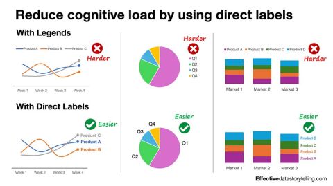
Whenever your chart uses a legend, you add cognitive load to the equation. It may seem like a minor inconvenience if someone has to glance back and forth between a chart and its legend, but those lit…
724652016 viral
Data Visualization8 months ago

LinkedIn Content Strategy & Writing Style
Author of Effective Data Storytelling | Founder + Chief Data Storyteller at AnalyticsHero, LLC | Forbes Contributor
1 person tracking this creator on ViralBrain
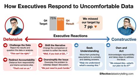
Brent Dykes positions himself as the premier authority on the bridge between raw analytics and executive influence, moving beyond technical visualization to master the psychology of persuasion. His content strategy centers on deconstructing the "dashboard fallacy," arguing that tools alone cannot drive action without a structured narrative that provides context, comparison, and a clear "so what." He is notable for his ability to translate complex data literacy into tactical communication frameworks, such as his specific breakdown of defensive versus constructive executive reactions to uncomfortable data. By intersecting cognitive psychology with data visualization, Dykes transforms the role of the analyst from a mere reporter into a strategic storyteller who intentionally guides stakeholders toward informed decision-making.
73.8K
15.3K
253
—
4.4
40
1
Whenever your chart uses a legend, you add cognitive load to the equation. It may seem like a minor inconvenience if someone has to glance back and forth between a chart and its legend, but those lit…
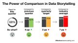
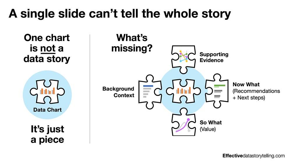
A single statistic in isolation doesn’t communicate much. A number like 68% might look impressive, but without context, it’s an empty figure. What gives a number meaning is comparison. Without a co…
Some people feel uncomfortable steering the audience toward a particular takeaway. They worry that data storytelling isn’t “objective” and feel that the data should simply speak for itself. What the…
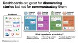
Many people continue to believe dashboards tell data stories. They don’t. And they were never designed to (despite what tool vendors say). Dashboards are great for monitoring key metrics and helping…
Most executives support using data—until the data tells a story they don’t want to hear. When results fall short of expectations, leaders react. And those reactions can either shut down an insight or…
I’m sorry, but a chart isn’t a data story. It’s just a piece. When you share a single chart without context, your audience is forced to assemble the rest of the puzzle on their own. And most of the…
4.4 posts/week
Posts / Week
1.8 days
Days Between Posts
1
Total Posts Analyzed
HIGH
Posting Frequency
252.9%
Avg Engagement Rate
STABLE
Performance Trend
350
Avg Length (Words)
HIGH
Depth Level
ADVANCED
Expertise Level
8/10
Uniqueness Score
YES
Question Usage
0.1%
Response Rate
Writing style breakdown
Professional, educational, and highly structured.
Conversational but polished; feels like a seasoned consultant or instructor addressing practitioners.
Strongly informative and explanatory, with light persuasive framing (guiding toward best practices or offerings).
Not poetic or flowery; clear, concrete, and concept-focused.
The voice projects authority without arrogance: “In my work, I’ve seen…”, “I often…”, “I’ll break down…”.
Medium-formal: clear sentences, correct grammar, professional vocabulary.
Still accessible: uses contractions (“don’t”, “won’t”, “I’m”) and occasional colloquial phrases (“head-on”, “sea of data noise”, “the data should simply speak for itself”).
No slang, no coarse language.
Calm, steady, and confident rather than hyped or dramatic.
Moderate energy: enough emphasis to keep attention, but not breathless.
But let’s be honest…
That’s not manipulation—it’s focused communication.
Tone is constructive and optimistic: even when pointing out misconceptions, it focuses on solutions and better practices.
Rhetorical questions, especially at the beginning (to frame issues) and at the end (to invite engagement).
Parallel structures and repeated patterns (“Why it matters / What caused it / How it fits / What to do next”).
Conceptual contrasts (dashboards vs stories, chart vs story, number vs context, resistance vs curiosity).
Direct labeling is a simple fix.
That’s the power of comparison.
A single statistic in isolation doesn’t communicate much.
Puzzle piece vs full picture.
Sea of data noise.
move from resistance to curiosity
bridge the gap
turn numbers into compelling stories
transform data into engaging stories
Dominant perspective: Second person (“you”) to address practitioners directly.
Reference experience (“In my work, I’ve seen…”, “I often direct label my charts…”).
Announce events or offers (“I’ll break down why dashboards…”, “I’m excited to offer…”).
Occasional first person plural to connect professionally (“we enter Thanksgiving”, “we place numbers side by side”).
Think about how you’re leveraging contrast…
Don’t let it go unused.
Prefers clear nudges over hedgy suggestions, but phrasing remains respectful, not bossy.
But let’s be honest…
They worry that…
What they don’t realize is this:
Sign in to unlock the full writing analysis
Free tools to help you write, score, and benchmark in the same style.
Other creators worth studying alongside Brent Dykes.

Brad Jacobs
Chairman and CEO, QXO, Inc.
66 Viral Score

Hanlie Van der Vyver
Career Coach | Burnout Workshops & Talks | The Interview School | Inclusive Talent Sourcer (Tech) | Master’s Research: Recruiter Burnout
6 Viral Score

Enrique Rubio
Founder, Hacking HR | Top 100 HR Global HR Influencer | HRE’s 2024 Top 100 HR Tech Influencers | Speaker | Future of HR
10 Viral Score

Michael Quinn
Chief Growth Officer | 3x LinkedIn Top Voice | Forbes Contributor | Adjunct Professor | Army Veteran
5 Viral Score

Brian Fink
I bring people together to solve complex problems.
7 Viral Score

Briana Kelly
Executive Development at Amazon
278 Viral Score
ViralBrain plans, writes, and schedules your LinkedIn content — using official LinkedIn APIs so your account stays safe.
Write like Brent Dykes.